
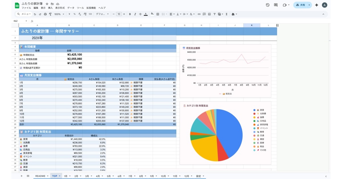
A palette that keeps money talk light
Once two people share a budget, opening the file becomes a signal that a conversation is about to happen. If the screen you open is heavy — deep browns, warning reds — you brace yourself a little every time.
The Sky Apricot edition is built to take that weight off. A cool sky-blue ground with apricot as the accent: the blue keeps figures legible, the apricot stops the whole thing from turning clinical.
Note: The template and all UI/labels are in Japanese. It’s intended for Japanese-speaking households.
What the two colors are each doing
Blue keeps digits from sinking
When you’re tracking place values, a neutral cool ground makes black text sit clearly on top of it. Compared with warm backgrounds, it’s harder to misread a digit while your eye is running along a row — which matters when you’re comparing twelve monthly sheets against each other.
Apricot brings the temperature back
Built in blue alone, the screen reads as pure admin. Putting apricot into the headings and emphasis keeps some warmth in something you open every day.
Designed for one pass a day
This colorway suits logging the day’s spend in a single short session — morning, or right after you get home. You pick five things (date, amount, category, payment source, liability) and the apportionment and settlement are automatic, so a day’s worth takes well under a minute. There are no macros and no Apps Script, so no permission dialog gets in the way, and you can open it on a phone and enter it there.
At month end it prints the settlement as “B owes A ¥12,800,” which removes the part of the conversation where you count.
It survives a phone screen
The other effect of a cool ground is that it’s harder to lose your place on a small display. Open a monthly sheet on a phone and only a few columns fit, so you end up scrolling sideways between the amount and the category. When the contrast between ground and rules is straightforward, you’re less likely to lose track of which row you’re on mid-scroll.
If your plan is to enter what you just paid while you’re still out, that legibility is what makes the habit stick.
Same workbook as Sakura Duo
All three colors share the same sheets, calculation logic and categories; only the palette differs. How the split ratio works, and how payment source × liability absorbs shared, reimbursed and miscoded spend, is explained on the Sakura Duo edition page.
Who it suits
-
A good fit — you want legibility first; you’ll use it in a bright room or through summer; you’d rather keep money admin brisk.
-
Not a good fit — you want the file to blend into the room’s decor. The Muted Linen edition is the one for that.
-
Price: ¥980 (incl. tax)
-
Free trial: January-only trial (Excel. The palette is the Sakura Duo edition, but the sheets and logic are identical to this one)
-
Distribution: BOOTH (product page)
-
Format: Excel / Google Sheets
-
Color variations: Sakura Duo edition / Muted Linen edition
-
Series: Password Manager Sheet (second release in the Digital Inventory Series)