
Budget templates fail because people stop opening them
When a household budget stops getting used, it’s rarely for lack of features. It’s that the file gets opened less often — and one reason for that is a design that looks out of place in the room it lives in. Leave a loud palette open on the living-room monitor and it competes for attention every time you walk past, so eventually it gets closed and filed away.
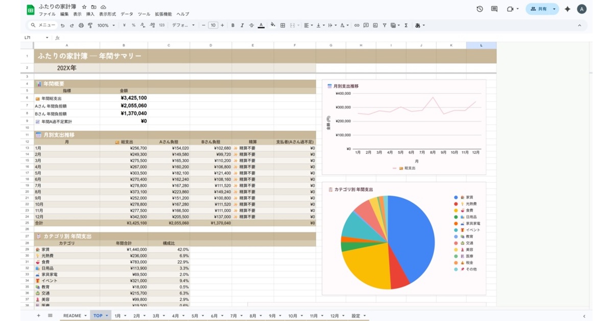
The Muted Linen edition is built to be left open. A quiet muted-beige and linen palette that doesn’t fight the room.
Note: The template and all UI/labels are in Japanese. It’s intended for Japanese-speaking households.
Why the colors are dialled down
Lower saturation pushes the numbers forward
What you actually read in a budget is amounts and settlement figures. When backgrounds and headers are highly saturated, your eye lands on color first and spends longer hunting for the number. Drop the saturation and the text contrast does more of the work, so the same layout reads faster.
Brightness steps that survive long sessions
Reviewing a year means scrolling through dozens of rows, back and forth. Wide brightness gaps between the white ground and the decoration are tiring over that distance. Muted Linen keeps those steps close together, which suits sitting down with the annual summary.
Built for a workbook you never close
If you pick this colorway, the workflow it pairs with is not month-end catch-up. It’s leaving the file open on a living-room device and adding one row when money is spent. There are no macros and no Apps Script, so there’s no permission prompt each time you open it, and the same file works from a phone, laptop or tablet. Low friction to open and a palette you don’t mind seeing work together.
It holds up in print and in monochrome
The other advantage of muted tones is that the information survives losing its color. Print the annual summary at year end, or screenshot the settlement to send to your partner, and highly saturated schemes tend to collapse — headings and body text become indistinguishable once converted. Muted Linen builds its hierarchy from brightness in the first place, so the structure remains when the color doesn’t.
If you plan to keep these records for a few years, that difference shows up later.
Same workbook as Sakura Duo
Sheets, calculation logic and categories are all shared; only the palette differs. How the split ratio is configured, and how payment source × liability absorbs shared, reimbursed and miscoded spend, is covered on the Sakura Duo edition page.
Who it suits
-
A good fit — you want the workbook permanently open; your room leans natural, wood and linen; pink reads as too cute.
-
Not a good fit — you want strong color coding to tell categories apart. The Sky Apricot edition gives you more contrast.
-
Price: ¥980 (incl. tax)
-
Free trial: January-only trial (Excel. The palette is the Sakura Duo edition, but the sheets and logic are identical to this one)
-
Distribution: BOOTH (product page)
-
Format: Excel / Google Sheets
-
Color variations: Sakura Duo edition / Sky Apricot edition
-
Series: Password Manager Sheet (second release in the Digital Inventory Series)